Thursday, April 22, 2010

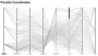
Parallel Coordinate Map


A parallel coordinate plot is a plot which shows the connection between multiple variables. By intertwining the data, a plot is created that shows how each variable is associated and the degree to which each is related.
Direct URL: http://perlitalabs.wordpress.com/2009/11/12/parallel-coordinate-visualization-with-protovis/

Star Plot


A star plot is a plot which shows a variables behavior in relation to all other variables. In other words, all variables can be seen in one star plot, helping to determine the overall relationship between each variable.
Direct URL: http://visalix.xrce.xerox.com/index.php?page=help

Correlation Matrix


A correlation matrix is a matrix which visualizes the strength correlation between multiple variables. The correlation between variables can be useful in determining whether or not one variable has an effect on the other.
Direct URL: http://yin.che.wisc.edu/images.htm

Similarity Matrix


A similarity matrix is a matrix which visualizes the strength of similarity between multiple variables. This is very useful when trying to determine which variable can be substituted for one another.
Direct URL: http://www.biomedcentral.com/1471-2164/8/353/figure/F5?highres=y

Stem and Leaf Plot


A stem and leaf plot is a histogram which measures variables as groups and applies them to a common measurement. In other words, stem and leaf plots represent the distribution of certain variables.
Direct URL: http://www.learner.org/courses/learningmath/data/session3/part_d/histogram.html

Box Plot


A box plot is a graph which uses boxes to represent variation in a measured variable. It also is useful in determining location in relation to the desired parameters.
Direct URL: http://www.itl.nist.gov/div898/handbook/eda/section3/boxplot.htm

Triangular Plot


A triangular plot is a graph in the shape of a triangle which measures a certain variables. Each corner represents a variable and the middle part of the triangular plot represents the connection between each variable.
Direct URL: http://www.pmel.noaa.gov/maillists/tmap/ferret_users/fu_2007/msg00384.html

Windrose


A windrose is a beautiful graph which is used by meteorologists to measure weather variable in connection with which direction the wind is blowing. This windrose shows air temperature in connection with wind direction.
Direct URL: http://www.vistadatavision.com/index.php?page=wind-rose

Climograph


A climograph is a graph which links two weather related variables to see if there is a common factor between the both of them. Using a line graph and a bar graph, this climograph links precipitation and temperature.
Direct URL: http://www.uwsp.edu/gEo/faculty/lemke/geog101/lecture_outlines/09_global_climate_patterns.html

Population Profile


A population profile is a graph which explains a certain aspect of a population. These are commonly used in demographic studies because they can decipher separate data into age groups or any other desired variable. This specific population profile represents the population of males and females in each age group in a developed country.
Direct URL: http://www.tenebrae.org/coursework/lecture-notes/population-pyramids.htm

Scatterplot


A scatterplot is a graph which takes measurements from a desired variable and applies them to a map. The map contains many different dots, which each represent a value of measurement. This map shows the Alaska Pipeline Ultrasonic Calibration Data.
Direct URL: http://www.itl.nist.gov/div898/handbook/pmd/section6/pmd622.htm

Index Value Plot


An index value plot is a plot which takes the index value of a variable and plots it to see if there are any discrepancies. It also shows whether there was a positive or negative change in the index value. This index value plot measures the Mississippi River streamflow.
Direct URL: http://ks.water.usgs.gov/waterdata/climate/

Lorenz Curve


A Lorenz curve is a graph which measures a variable and how much it differentiates from the line of perfect inequality. This is very useful in economics when measuring personal income. This graph shows just that Lorenz curve.
Direct URL: http://www.knowledgerush.com/kr/encyclopedia/Lorenz_curve/

Bilateral Graph


Bilateral graphs are graphs which measures two variables on a graph. A bar graph is commonly used because it is easy to differentiate between the two bars. This specific bilateral graph is a bar graph of representing a hypothetical clinical study to measure the effect of a drug.
Direct URL: http://www.fda.gov/RegulatoryInformation/Guidances/ucm127509.htm

Nominal Area Choropleth Map


A nominal area choropleth map shows the number of a given variable in a given area by using different colors to represent that given variable. The map is used to represent certain nominal data. This specific map shows the development regions of Nepal.
Direct URL: http://geoportal.icimod.org/CapacityBuilding/TrainingContent.aspx?mTab=cb&TCID=10&TSCID=9&TID=23

Standardized Choropleth Map


Standardized choropleth maps are maps in which the measured variable is standardized to make the information easier to decipher. The data is also standardized to better represent the variable it is measuring. This leads to less distortion on the map. This specific map represents the percentage of individuals living in poverty by county.
Direct URL: http://www.cdc.gov/pcd/issues/2007/oct/07_0091.htm

Unstandardized Choropleth Map


Unstandardized choropleth maps are just the opposite of standardized choropleth maps. These maps do not standardize the variable measurements, instead the map just divides them into groups with no statistical analysis. This specific map shows the U.S. Distribution of population by race in 2000.
Direct URL: http://www.censusscope.org/us/map_common_race.html

Univariate Choropleth Map


Univariate choropleth maps are maps which represent one variable of information. Colors, patterns, or shadings are used to give an accurate portrayal of the variable being measured. This map shows percentage of individuals living in poverty.
Direct URL: http://www.cdc.gov/pcd/issues/2007/oct/07_0091.htm

Bivariate Choropleth Map


Bivariate choropleth maps are maps in which two variables are being measured and represented. This can be useful when comparing the two variables. An example of this would be this specific map which represents the susceptibility of landslides and elevation.
Direct URL: http://eost.u-strasbg.fr/omiv/barcelo_area_landslide_hazard.html

Unclassed Choropleth Map


An unclassed choropleth map is similar to a classed choropleth map, except there are no specific classifications, hence the unclassed term. These maps often can portray the same information of a classed map but it is harder to determine the accurate perception of the map. This map shows the birthrates in Europe through a proportional degree of darkness.
Direct URL: http://geoanalytics.net/and/papers/ica01.pdf

Classed Choropleth Map


A classed choropleth map is a choropleth map which separates the measured variable into certain classifications. This makes it easier to determine which classes are in a geographical area. This specific classed choropleth map shows the birthrate of Europe.
Direct URL: http://geoanalytics.net/and/papers/ica01.pdf

Continuously Variable Proportional Circle Map


A continuously variable proportional circle map is a map which uses circles to measure changes in a certain geographical area. Since the variables are continuously changing, different circles sizes are used to gauge these changes. This map represents the number of internet users in Europe in 2004.
Direct URL: http://www.geog.ucsb.edu/~jeff/gis/proportional_symbols.html

DOQQ


DOQQ or digital orthophoto quarter quadrange is a map of a geographical region in which the picture is made flat. In other words, the displacement of the land due to elevation and terrain changes are removed for easier viewing circumstances. This picture shows a DOQQ of Washington, D.C.
Direct URL: http://seamless.usgs.gov/products/1doqq.php

DEM


DEM or digital elevation model is a map that represents the terrain of a geographical area. This can be used to see the contour of the land as well as what distinguishing terrain features are incorporated in the land. DEMs can also be used on different planets, like this picture of Mars.
Direct URL: http://en.wikipedia.org/wiki/Digital_elevation_model

DLG


DLG or digital line graphs are represented by digital vector form which can be applied to a topographical map. These maps are also used by the USGS. This specific map represents the Crater Lake National Park.
Direct URL: http://oregonexplorer.info/craterlake/dlg.html

DRG


DRG or digital raster graphics is a paper map that is scanned into a computer. Used by the USGS (United States Geological Survey), the uploading of this map makes it easier for cartographers to create a higher resolution map, as well as enhance features. This is a map of Juneau, Alaska that was scanned into a computer.
Direct URL: http://egsc.usgs.gov/isb/pubs/factsheets/fs10602.html

Isopleths


Isopleths are yet another type of contour line which represents a variable in a large area. If the variable cannot be pinpointed, then isopleths are used. This is common with population density. This specific map shows an airborne toxic chemical. Since it is a large geographical area, an isopleth is used.
Direct URL: http://www.stonelions.com/Jacksonville.htm

Isopach


An isopachs are contour line which represent the thickness of rock or land. These are commonly used in resource excavation, such as coal. This specific map portrays an area where coal is being excavated. Notice the isopach lines representing the thickness of sediment.
Direct URL: http://www.kgs.ku.edu/PRS/Coal/mineral.html

Isohyet


Isohyets are lines on a map which represent elevation. Each elevation is divided into a certain height and then sectioned off by the isohyet. This specific map shows the elevation of Africa.
Direct URL: http://artsci.wustl.edu/~anthro/courses/306/geography.html

Isobar


Isobars are lines on a map which represent areas that have the same air pressure. These maps are very useful for pilots, who have to be conscious of air pressure when flying. You can see the isobars on the map, they are the purple colored lines.
Direct URL: http://www.wrh.noaa.gov/slc/projects/Dec2526snow2.htm

LIDAR


LIDAR is a type of remote sensing system used to collect data and transform it into a three dimensional representation of a topographical area. Attached to aircrafts, mounted lasers scan the area and create a representation of an area. This specific LIDAR picture is three dimensional picture Lower Manhattan after the World Trade Center attacks.
Direct URL: http://www.noaanews.noaa.gov/stories/s798.htm

Doppler Radar


Doppler radar is a radar used in weather forecasting. Through the use of the Doppler effect, Doppler radar produces images of weather patterns which can be used to help predict what will happen in the future. This picture shows Hurricane Charlie hitting Florida.
Direct URL: http://www.weatherusa.net/blog/index.php?month=August_2004

Black & White Aerial Photo


A black and white aerial photo is another type of photo taken from an aerial vehicle. It is very basic and is used to document a geographical area from an elevated point of view. This black and white photo shows Pearl Harbor.
Direct URL: http://pm3042.k12.sd.us/Event/AttackonPH.htm

Infrared Aerial Photo


An infrared aerial photo is a photo taken from some aerial vehicle. Using infrared, certain aspects of a geographical area that cannot be seen in a regular photo, such as temperature, can be visibly acknowledged. This infrared aerial photo shows an area known as Discovery Bay.
Direct URL: http://www.deltanationalpark.org/tag/tourism

Cartographic Animation


Cartographic animations are maps which use motion to portray information. This is commonly seen in weather forecasts when looking at certain weather patterns, such as hurricanes. It can also be used for other pieces of information, such as the development of the Baltimore area, which is represented in this map.
Direct URL: http://www1.elsevier.com/homepage/sad/cageo/cgvis/acevedo/acevedo.htm

Statistical Map


A statistical map is any map which represents a certain variable, learned through the use of statistical analysis. Statistical maps can measure many different types of variables. This specific map measures the amount of people online in a portion of the Arab world.
Direct URL: http://www.arabdev.org/map

Cartogram


A cartogram is a type of thematic map used to represent information in a non conventional way. Instead of using land area as the basis, a cartogram distorts the land area and reconfigures it to represent a certain aspect of information. This specific cartogram shows the 1996 Presidential vote results, through a peculiarly skewed map.
Direct URL: http://www.viz.tamu.edu/faculty/house/cartograms/PresVote.html

Flow Map


A flow map represents a change in a certain aspect of a geographical area by using arrows to show which way the information is flowing. This can be seen on the map provided. The arrows represent a migration trend in a given geographical area. The direction of the arrow indicates which way the people are migrating.
Direct URL: http://geoportal.icimod.org/CapacityBuilding/TrainingContent.aspx?mTab=cb&TCID=10&TSCID=9&TID=23

Isoline Map


An isoline map is a map that represents certain trends in an area. Using lines, the map portrays whether the trend is increasing or decreasing. In this specific map, the annual precipitation of a given geographical area is presented by using lines to differentiate between the amount of precipitation in each region.
Direct URL: http://geoportal.icimod.org/CapacityBuilding/TrainingContent.aspx?mTab=cb&TCID=10&TSCID=9&TID=23

Proportional Circle Map


A proportional circle map is a map which represents certain information in a geographical area by using circles proportionate to the represented information. In other words, if the circles are small, then the number of what ever is being measured is small and vice versa if the circles are large. This specific map shows the Hispanic population in the United States. Notice that the smaller circles represent a smaller number of people, while the larger circles represent a large number of people.
Direct URL: https://www.e-education.psu.edu/natureofgeoinfo/book/export/html/1553

Choropleth Map


A choropleth map is a type of thematic map, in which certain colors or patterns are used to represent certain information. These are a very popular type of map because it makes it very easy to differentiate between certain characteristics of the map. This specific map shows the access to safe drinking water in a specific area. Notice the different variations of color used to represent a certain information bracket.
Direct URL: https://www.e-education.psu.edu/natureofgeoinfo/book/export/html/1553

Dot Distribution Map


A dot distribution act is a map which uses dots, each of which represents a variable, to portray knowledge about a certain geographical area. Though tiny, each dot usually represents one piece of information. For example, each dot on this map represents 10,000 acres of land used to harvest corn.
Direct URL: http://geoportal.icimod.org/CapacityBuilding/TrainingContent.aspx?mTab=cb&TCID=10&TSCID=9&TID=23

Propoganda Map


A propaganda map is a map used to portray a certain view. These were commonly used in the World Wars as a way of rallying or discouraging troops. This specific map was used to intimidate the Allied troops during World War II by implying that the Allied troops should give up because they were surrounded.
Direct URL: http://go.owu.edu/~jbkrygie/krygier_html/geog_222/geog_222_lo/geog_222_lo05.html

Hypsometric Map


A hypsometric map is a type of topographic map, similar to the planimetric map with the exception that it includes elevation. Using contour lines, the elevations of the geographical area is added so it is visible to the reader. This map shows the elevations in a section of France.
Direct URL: http://www.reliefshading.com/colors/hypsometric.html

PLSS Map


A PLSS map or Public Land Survey Systems map is a map that subdivides land in a geographic area, similar to the cadastral map. Using a series of rectangles, PLSS subdivides land to show which land is available. This map shows principal meridians and base lines in the United States.
Direct URL:http://gis.nwcg.gov/giss_2006/cd_contents.html

Cadastral Map


A cadastral map is a map that shows the divides between sections of land. They tend to focus on the ownership of land. This map displays a section of Grzymalow from 1852. Upon closer inspection, the individual plots of land are sectioned off to reveal ownership.
Direct URL: http://www.jewishgen.org/galicia/CadastralMapProject.html

Wednesday, April 21, 2010

Thematic Map


A thematic map is a map that shows the a particular similarity in a geographical area. In other words, it displays a similar variable across a wide range. This map shows the population percent change from 1990-1996 in the United States.
Direct URL: http://www.sou.edu/Geography/JONES/GEOG280/sample.htm

Topographic Map


A topographic map is similar to a planimetric map, except on a much larger scale. This provides more detail and a better understanding of the geographical area. This map shows the city of Cluj in Romania.
Direct URL: http://www.loc.gov/rr/geogmap/guide/gmillgen.html

Planimetric Map


A planimetric map is a map that disregards vertical aspects and focuses specifically on horizontal aspects. In other words, elevation is not prevalent. This map shows an old walled Chinese city.
Direct URL: http://www.loc.gov/rr/geogmap/guide/gmillgen.html

Mental Map


A mental map is a map drawn from an individual's own perspective and memory, hence the term mental. This specific map shows the urban comfort and fear in Brasov, Romania through the eye's of the artist.
Direct URL: http://web.ics.purdue.edu/~smatei/MentalMaps/resource.html